Case Study: Futures Education & Training
About Futures
Futures Education & Training is a registered training organisation focused on building real workforce capability. Designed in partnership with industry, Futures delivers accredited programs that prepare learners for employment, not just assessment.
With a commitment to clarity, progression, and practical skill development, Futures works across corporate, community, and employment sectors to address genuine workforce demand. By aligning training with real industry needs, Futures is establishing a reputation for readiness, integrity, and measurable outcomes.

Years of industry alignment have shaped Futures’ commitment to real outcomes.
The Objective
-
Reposition Futures as an industry-designed, outcome-focused training provider
-
Clarify differentiation in the WA RTO market
-
Strengthen credibility with employers and learners
-
Align brand, messaging and identity with workforce readiness
Our Approach
Facilitated strategic workshops to extract positioning, purpose and differentiators
Conducted competitor and market analysis within the WA RTO landscape
Defined a clear positioning statement and unique value proposition
Reframed messaging from completion-focused to outcomes-led
Developed a refined visual identity aligned to readiness and progression
The Outcome
-
Clear industry-aligned positioning and stronger articulation of co-designed, co-delivered programs
-
Improved employer conversations and partnership potential and a distinct identity separate from their sister company Youth Futures.
-
A cohesive brand foundation ready to scale
-
Before
Compliance-heavy messaging
Limited differentiation in market
Visual identity lacking strategic direction

What we delivered
Brand Strategy:
Clarified their market positioning and rolled out a cohesive brand across all communications
Logo:
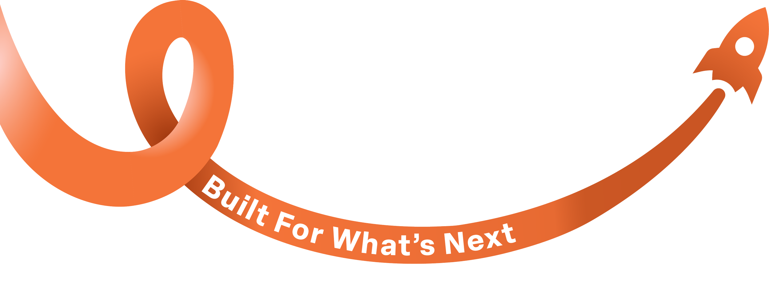
Tagline:
Built for what’s next
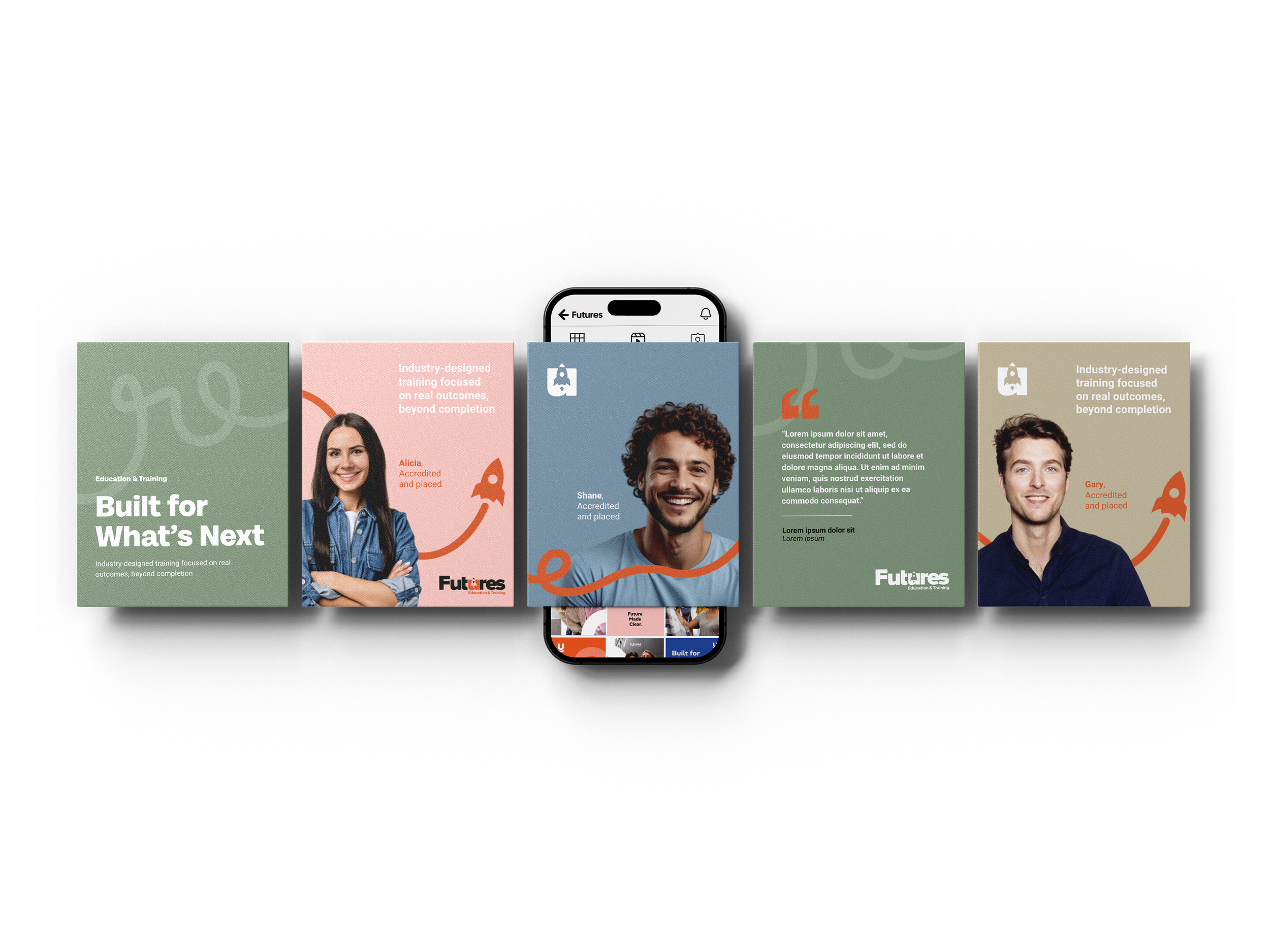
Digital and Social Media:
Developed an engaging website, provided ongoing support, and strengthened their social presence with captivating on brand visuals.
Website:
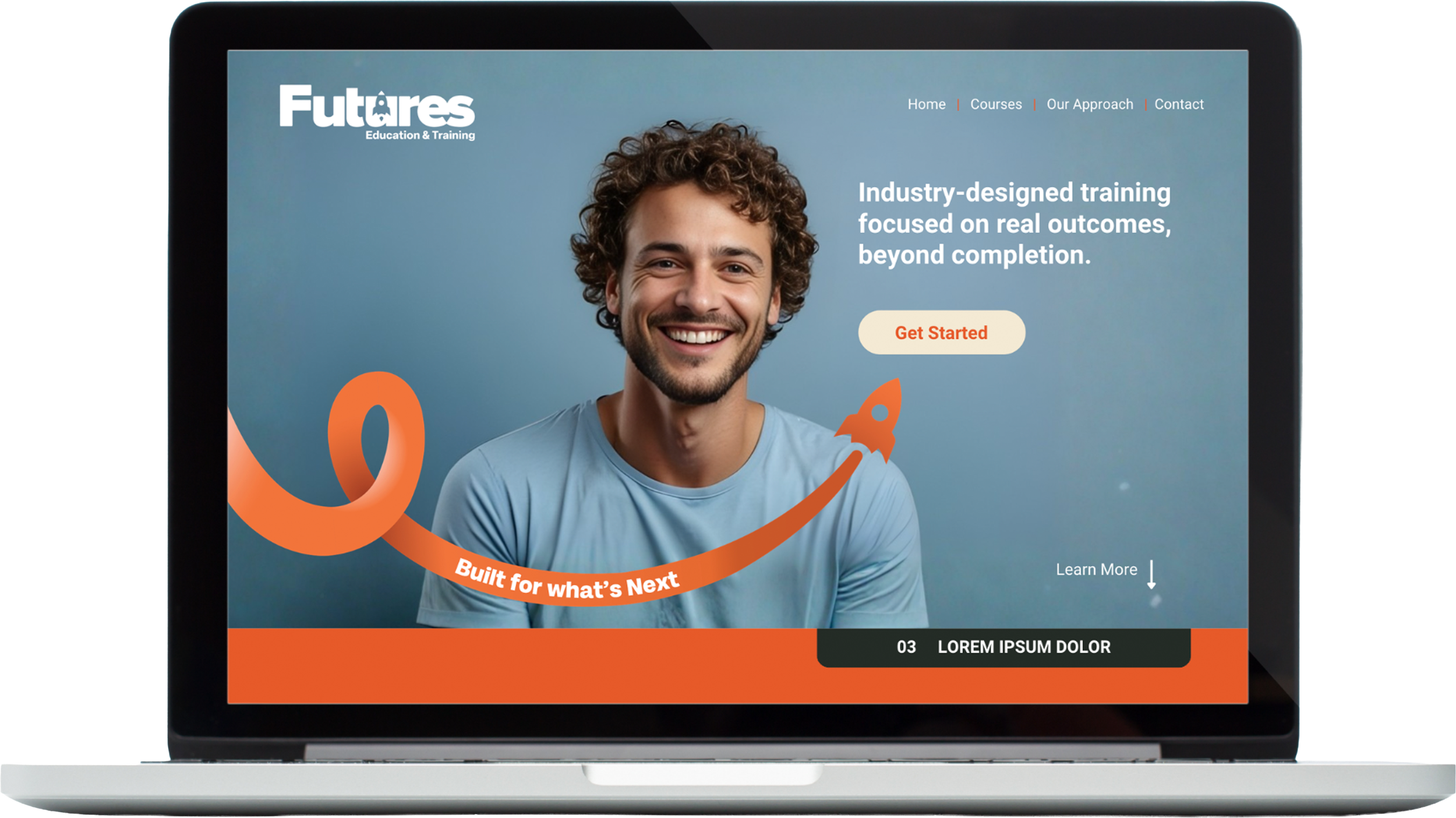
Human and outcome focused
Colour & Icon coded course categories

Icon:
Iconography
Outcome-driven positioning
Clear industry alignment
Defined brand narrative
Cohesive, scalable visual identity
Image & Photography direction

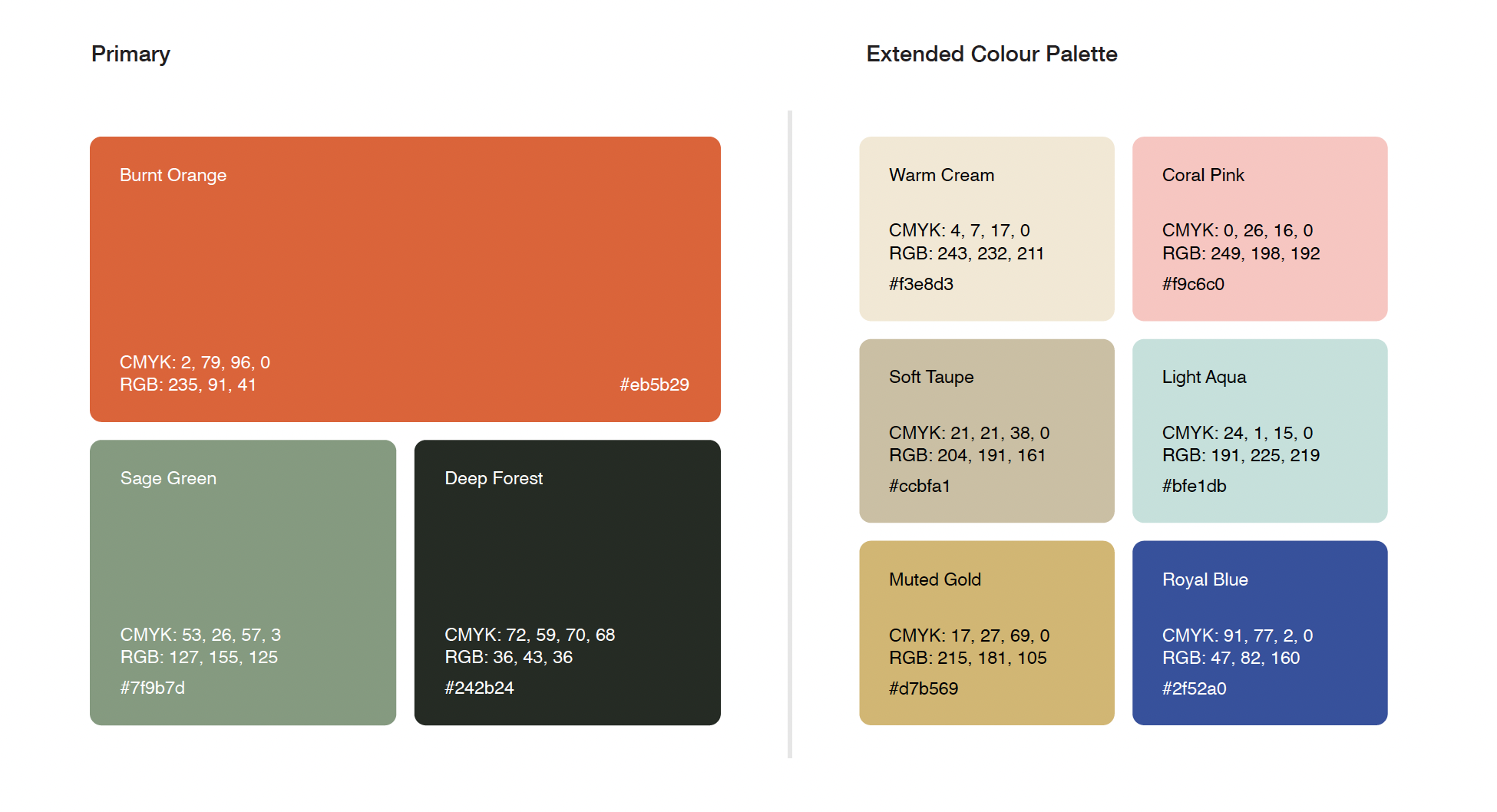
Primary & Secondary Colour Palete
“From day one, the process was structured, collaborative and incredibly clear. The archetype development and brand direction captured exactly who we are and where we’re heading. We’ve been extremely impressed with the turnaround time, the quality of thinking, and the final logo outcome. Futures now has a brand foundation we’re proud to launch with.”
Matt De Barro - RTO Manager